Last night, the NHL and Adidas made their pact official, as the rebranded uniforms for each team were unveiled, and to say most were rather disappointing would be an understatement. Since every team unveiled their new home looks, rather than go through each team, I'll go through the highlights and lowlights.
Before getting into that, it should be noted that most of the teams will carry over their looks from last year, with the collar being the lone exception, as it will look decidedly different.
The highlights: There were really only four teams who benefited the most from the Adidas rebrand.
The Colorado Avalanche were the worst affected by the Reebok branding of 2007, but now that the jagged striping that adorned their first looks has returned, it automatically puts the Avs in the highlight category. Granted, I would have loved for more than gray separating the maroon and the blue, but given how badly their Reebok jerseys looked, you'll take what you can get.
I can technically put the Carolina Hurricanes in the highlights category, since they returned the storm warning flags onto the waist stripes, albeit in a more subtle manner. Adding more black to the waist and arm stripes actually adds a little more to what was a rather ordinary look.
The Minnesota Wild almost always put out winners when it comes to sweaters, and this look is no exception. The fact that they're going with forest green as their regular home colors only cements the look as one of the best of the rebranding.
I'm going to level with you: I had extremely low expectations for what the Vegas Golden Knights were going to trot out. To say that they exceeded expectations would be an understatement, as it looks passable, though the red does look out of place.
As for lowlights, let's just say that Calgary, Ottawa, Columbus, Vancouver, and Washington all had their chances to make a fresh start, and none of them took that chance, instead opting for familiar looks. Also, Buffalo only took half a chance, getting rid of the piping, but for some reason, keeping the numbers on the front of the jersey.
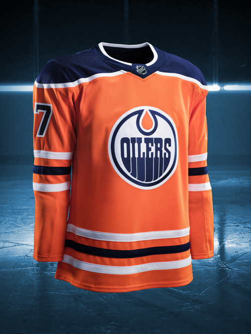
Edmonton going with orange as a full-time home jersey may be a nod to their early days in the WHA, but that doesn't mean it should have remained as such today. Going with a darker shade of blue doesn't help.
Nashville got rid of the piping, opting for a cleaner look. Too clean, if you ask me, as there's not nearly enough navy on the jersey. Even a smaller striping of navy on the waist and arm stripes would have brought it out of the lowlights category.
This was the rebranding that the New Jersey Devils went with? I was hoping for a lot more than just broadening the arm stripes and getting rid of the waist stripes, which is the biggest no-no that they could have done.


No comments:
Post a Comment