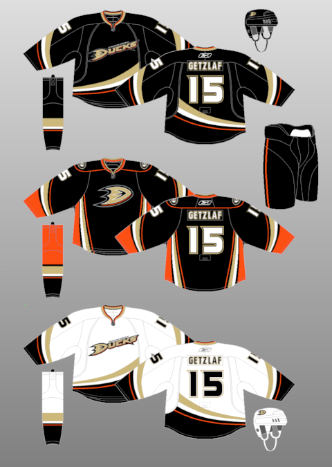
When the RBK Edge jerseys were introduced, the Anaheim Ducks were a year removed from losing the "mighty" in their name. The design of their original jerseys since being just the Ducks is quite similar to the current set of jerseys with the exceptions being the collar and the adjusting the swoop designs to fit within the confines of the RBK jerseys. A third jersey was introduced this year, which had the webbed D as the primary logo and more orange in its jersey. Ultimately, I would like for the Ducks to adopt the webbed D as its primary logo and the wordy "DUCKS" logo that is there now to be on the alternate jersey. I've never been a fan of the collar that the Ducks (or any other team that uses it) use in general, as it just looks out of place. Not horrible looking, but not too great, either.
No comments:
Post a Comment