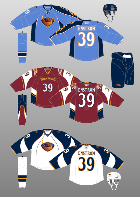
If you were to ask me which NHL team makes the worst choices when it comes to jerseys, I wouldn't hesitate to tell you it's the Atlanta Thrashers. Sure, the Colorado Avalanche and Dallas Stars are close, but in their respective histories, they have had some really good designs (more on those as I get to those teams). Atlanta, it just simply hasn't happened since their inception in 1999. Yes, their inaugural jerseys were actually not that bad looking, but the dark jerseys had quite possibly the worst logo idea for the front of their jersey. It's actually the shoulder patch in a perfect world, but it was inexplicably made the primary logo for the dark jerseys. Sadly, it's not the worst idea for a jersey...
Yes, the sky blue vomit that the Thrashers call a jersey made their debut in the 2003-04 season, and were made the home jerseys in the 2006-07 season. Why this jersey is still in existence is beyond me, even with the Reebok Edge design (which is marginally better, though it doesn't even change my opinion). The things that made the road whites unique were changed with the Reebok design, making it worse. And then there's the third jersey, which on paper, isn't so bad, but in practice, it just doesn't do anything for the imagination. Here's a question, do you know anyone who owns a home or alternate Thrashers jersey? No? Didn't think so.
No comments:
Post a Comment