
Before I begin, I would like to say that I generally don't like crapping on other hockey teams except for the Detroit Red Wings, and even then, I have to show some respect for the players on the team that exemplify class (e.g. Nicklas Lidstrom, Henrik Zetterberg, etc.). However, when it comes to jersey designs (of any sport, really), that becomes a different story. Last time, I took some time to look over one of the biggest blunders in the New York Islanders and their fisherman logo and jersey that only lasted two years, at the most. Now, if only the subject of today's piece would have only lasted as long, if not less than that.
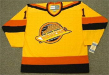
Today, the subject is the third jersey that the Boston Bruins unveiled during the 1995-1996 season. Now, take a good look at the picture above. Does anything about the jersey intimidate you? How about instances of laughter? (pauses to allow laughter) Okay, you can stop laughing now. As to why the jersey lasted until 2006 remains a mystery. The primary color on the jersey doesn't exactly inspire fear into the opponents. Before I go on, I'd like to ask what other NHL teams have used the color yellow as a primary color on their jerseys? (Answers, in case you're too lazy to look them up: Vancouver Canucks, who have twice used that as a primary color, with one for those infamous "flying V" uniforms in the early 80's and the other being what you see here from the late 80's:
The only other teams that have used yellow as a primary color on their jerseys are the Los Angeles Kings when they started out as an NHL franchise, with yellow as their primary home jersey. Those were accented with purple, which mirrored the Lakers basketball franchise that played in the same building that the Kings hockey called home. Those went the way of the dodo when the Kings traded for Wayne Gretzky in 1988 and the team changed the color scheme to black and silver. The Pittsburgh Penguins briefly went with yellow jerseys, as well, as did the Nashville Predators, albeit, as a third jersey. Those did not go over well.)
Back to the Bruins third jersey, in addition to the not so intimidating color, the logo was a bear head, one that actually may have looked like the bear was rather pleased with himself. Often derided as the "picnic bears" jersey, I will have to give some credit where it's due, if only for the thought. That is, the jagged designs around the cuffs and the bottom of the jersey, as well as the shoulders, offers some illusion of bear fur. It often gets lost because of the other elements, but I think it was a pretty good thing to have for what was otherwise, a pretty bad idea for a jersey.
No comments:
Post a Comment