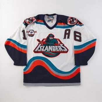
 Take a good look at the jersey in the picture above. Now, ask yourself where you have seen the fisherman before. If you answered on a fish sticks box, then step on up and claim your prize of absolutely nothing. Today's subject is the ill-fated New York Islanders jersey and logo that you see here. The entire design lasted all of two years (1995-1997), with the logo being scrapped after just a little more than a year. When the logo and subsequent jersey design were introduced prior to the 1995-1996 season, there weren't too many people who liked it. Compare that to the total makeover that the Washington Capitals had prior to that same season, and it's fairly easy why the Islanders' makeover experiment was a total disaster.
I will go out and defend this design, as I was in the minority and actually loved the design at the time it was introduced. Even now, I wish this design lasted for longer than it did. It was unusual and to me, was one of the better redesigns to that point. Obviously, it didn't do the team any good, as they still stunk up the joint during that period, and for that matter, stunk the year before the makeover and the few years after the experiment was over. Maybe some other team with the gall that the Islanders had in 1995 will introduce something eye-catching.
No comments:
Post a Comment