Monday, August 16, 2010
The Blues Look of the mid-90's
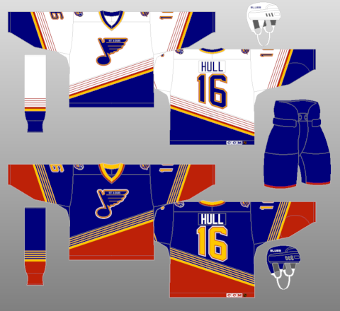
This piece has been bothering me for a while, but since today is somewhat slow, I can sneak this one in. This is actually a two-parter, as it covers both a team's home and away jersey for a specific time frame.
The St. Louis Blues have undergone some minor jersey changes in their time before 1994. No matter the look though, the Blue Note has always been at the heart of everything that the Blues have done. 1994 marked a rather dramatic change, though, as the color red was introduced in a more involved manner, as opposed to just a complimentary accent that it had been. As you can see by the picture, diagonal striping lifted from the Mighty Ducks of Anaheim (which by the way, if you're lifting from the Mighty Ducks design, then you're just reaching too far) and numbering that just simply looks odd because of the diagonal design. The home jersey (white for you folks that remember when hockey's home team wore white) isn't that bad, but the road jerseys have one of the most uninviting amounts of red that grace a jersey, for a team whose primary colors are blue and yellow. The thin striping in the diagonal design makes the jersey even more cluttered than what it is, but I do have to give the Blues credit for the shoulder patch, as it drives home the point of the team's name.
Thankfully, a third jersey came along in 1999 that signaled the beginning of the end of the diagonal eyesores, and that third jersey is the basis for today's Blues jerseys, and a current third jersey that is equally appealing.
Subscribe to:
Post Comments (Atom)

No comments:
Post a Comment