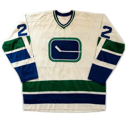
Yesterday, I talked a bit about the Los Angeles Kings' first looks and brought up the Vancouver Canucks' first looks. Well, what better way to segue into today's subject than the first looks of the Vancouver Canucks. As you can tell by the jersey above, the stick in the rink was around, and if you're wondering where the team could have thought about those Flying V jerseys that would make their debut in the late 1970's, look no further than the jersey's sleeves and the "V" that runs down the sleeves. Who knew that this would be a theme for the Canucks in their 40 years: weird and out there designs. It also has its charms, which makes the revival today all the more remarkable. Of course, this design will probably be only for this season, which like the 1970 design, is all too short for it to be out there. Of course, many people thought the Flying V jerseys lasted too long, but the Canucks could at least, claim to have been to the Stanley Cup Finals in them, so whether you liked it or not, you had no choice but to look at them.

No comments:
Post a Comment