Showing posts with label eyesore. Show all posts
Monday, August 16, 2010
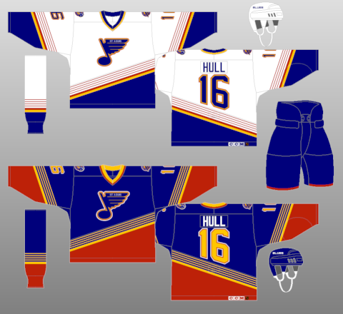
The Blues Look of the mid-90's
This piece has been bothering me for a while, but since today is somewhat slow, I can sneak this one in. This is actually a two-parter, as it covers both a team's home and away jersey for a specific time frame.
The St. Louis Blues have undergone some minor jersey changes in their time before 1994. No matter the look though, the Blue Note has always been at the heart of everything that the Blues have done. 1994 marked a rather dramatic change, though, as the color red was introduced in a more involved manner, as opposed to just a complimentary accent that it had been. As you can see by the picture, diagonal striping lifted from the Mighty Ducks of Anaheim (which by the way, if you're lifting from the Mighty Ducks design, then you're just reaching too far) and numbering that just simply looks odd because of the diagonal design. The home jersey (white for you folks that remember when hockey's home team wore white) isn't that bad, but the road jerseys have one of the most uninviting amounts of red that grace a jersey, for a team whose primary colors are blue and yellow. The thin striping in the diagonal design makes the jersey even more cluttered than what it is, but I do have to give the Blues credit for the shoulder patch, as it drives home the point of the team's name.
Thankfully, a third jersey came along in 1999 that signaled the beginning of the end of the diagonal eyesores, and that third jersey is the basis for today's Blues jerseys, and a current third jersey that is equally appealing.
Thursday, July 8, 2010
The "Lost" Blues Jersey
The mid-1990's were not kind to the St. Louis Blues. Every year that they made the playoffs, they always had to go through the likes of the Detroit Red Wings and Colorado Avalanche, often losing such battles. When they decided to jazz things up on their jersey, they went with more red in their jerseys, and even went as far as to lift from the original Mighty Ducks of Anaheim jersey design. If you asked me what I thought was the worst Blues jersey design, that would be it.
However, there was one jersey design for the Blues that was infinitely worse. Thankfully, it never made its way onto the ice. The jersey you see before you was to be the team's third jersey for the 1994-95 season. However, due to the lockout that wiped out half the season, combined with coach Mike Keenan nixing the jersey, it never saw light of day on the ice. Two questions come from this jersey: Who thought this would look good on a professional hockey team, and would Brett Hull have asked for a trade before he even had to wear this jersey?
Friday, April 30, 2010
Hunter's Vests Jersey
In between the valleys, they managed to get their heads above water in the early 2000's, when ownership changed hands and they made a couple of big trades, both of which would actually come back to bite them in their rears years later. First would be the trade with Ottawa Senators, which saw Zdeno Chara and the first round pick in 2001 that would become Jason Spezza go to Ottawa for disgruntled Senators star Alexei Yashin. Chara would have some success as a Senator before winning the Norris Trophy as a Boston Bruin while Spezza is currently the Senators' top center. Yashin had success early on, but the ridiculous signing of a 10 year contract by the Islanders caused Yashin's numbers to drop and the Islanders are still on the hook for that contract even though Yashin is no longer on the team. The other move involved Roberto Luongo, who was deemed expendable by the team and shipped to the Florida Panthers. There, he put great numbers despite a bad team in front of him, and before the 2005-2006 season, he was sent to Vancouver in another trade that is one of the worst ever, but that's a story for another day. The guy the Islanders kept? Rick DiPietro, who looked like a superstar before signing a 15 year deal and getting hurt...often.
Things did not look any better for the Islanders in 2002 when they introduced their third jerseys. Look at the picture and ask yourself who the creative genius was behind that. The navy blue darts that are on either side of the Islanders logo look horribly out of place and the orange rarely ever works on any jersey except for the Flyers. Not as evident, but still noteworthy is the rather skinny numbering on the jersey, which from a fair distance, would make the numbers hard to read.
Saturday, April 24, 2010
Kansas City Scouts
Now, the failures haven't been limited to just hockey, with the Athletics calling Kansas City home before leaving for Oakland in baseball and the Kings moving to Sacramento in basketball. However, no pro team failure looms larger than the NHL team that the city had called the Scouts. That team lasted only two years (1974-1976) before moving to Denver to become the Colorado Rockies. Of course, that incarnation didn't last long either before moving to New Jersey to become the Devils. Poor attendance and poor on-ice performance were cited as the biggest reasons for the failed stint in the NHL pool for Kansas City. However, one could surmise that the jerseys that the team wore were an ugly combination of the primary colors. Now, look at the jersey and ask yourself if the combination would have benefitted from one less color. Perhaps, but that's a moot point now, as the Scouts are merely a footnote in the now-New Jersey Devils history.
Tuesday, April 20, 2010
The Baby Food Jersey
In the early 2000's, the Nashville Predators felt the need to introduce a third jersey to the world. Given that their home and away jerseys were unique, to say the least, one had to wonder what the team would unveil that could possibly get people's attention. The end result is what you see in the picture above.Now, stop and tell me if a mustard colored jersey can intimidate anybody. No? I didn't think so. The fact that the mustard color looks like someone threw up on the jersey doesn't help matters, nor does the altered logo, which actually looks less intimidating than the primary logo. The collar design is weird, but that isn't necessarily a bad thing. It is too bad that the jersey's mustard color dominates the view, as one would need sunglasses to reduce the glare of something that just screams vomit.
Monday, March 22, 2010
Sea Sickness
The history of this rather unusual jersey dates back to 1996, or about the time that the NHL decided to break out the third jerseys for some teams. Tampa Bay was one of those teams, as they debuted what is dubbed "Sea Sickness." The name fits the jersey design perfectly, as the black and silver "rain drops" on a blue background, combined with what is supposed to be lightning bolts on the sleeves and bottom make this one of the most chaotic looks of all time. Throw in the silver shoulder colors to go with the primary blue and black, and the number designs, and it gets even worse. Not helping matters much would be the patches that the team would be putting to the right of the logo, the number 12 in a shamrock as a tribute to John Cullen as he was fighting cancer at the time being the first, and the all-star logo following. And did I mention that the Lightning were terrible during that time period?
In the early days of the third jersey in the NHL, there were some horrific designs. The Lightning "Sea Sickness" jersey is no exception; in fact, it is the poster child for what not to do when designing jerseys. Thankfully, it was killed off before 2000, and the current third jerseys the Lightning sport are much, much better...and less chaotic.
Saturday, March 6, 2010
The Flying V
It's a fairly well known fact that the Vancouver Canucks have had more makeovers than any other team in the NHL. The first makeover in the late 1970's involved the change from the colors of blue and green to the colors of black, orange, and yellow. Obviously, the new color scheme would not mesh with the logo they had at the time, so it would have to be a complete makeover, for sure. The result is the infamous "Flying V" jerseys. For much of the early 1980's, that was the jersey of the Vancouver Canucks, and while the road black versions of those jerseys were acceptable, at best, it was the yellow home versions that would cause blindness to even the most sharp sighted person. You have to give the people responsible for the design some credit for having the balls to come up with something different and even going so far as to have a back story behind the jersey design. Luckily, no one else has tried this design, although there have been quite a few jerseys that have clearly looked worse than what Vancouver donned in the early 1980's.
Thursday, March 4, 2010
The Burger King jersey
Monday, March 1, 2010
Canadiens 100th Year Anniversary Jersey: 1912
Thursday, February 25, 2010
When Jersey Designs Go Wrong: "Wild Wing"
Now, take a good look at the picture above, and ask yourself if this is what you would want to be wearing if you're a professional hockey player. All that needs to be said about the jersey is the "Wild Wing" mascot that emerges from the sheet of ice. I don't think there needs to be any other words for this amateur effort.
Saturday, February 20, 2010
Picnic Bears
Before I begin, I would like to say that I generally don't like crapping on other hockey teams except for the Detroit Red Wings, and even then, I have to show some respect for the players on the team that exemplify class (e.g. Nicklas Lidstrom, Henrik Zetterberg, etc.). However, when it comes to jersey designs (of any sport, really), that becomes a different story. Last time, I took some time to look over one of the biggest blunders in the New York Islanders and their fisherman logo and jersey that only lasted two years, at the most. Now, if only the subject of today's piece would have only lasted as long, if not less than that.
Today, the subject is the third jersey that the Boston Bruins unveiled during the 1995-1996 season. Now, take a good look at the picture above. Does anything about the jersey intimidate you? How about instances of laughter? (pauses to allow laughter) Okay, you can stop laughing now. As to why the jersey lasted until 2006 remains a mystery. The primary color on the jersey doesn't exactly inspire fear into the opponents. Before I go on, I'd like to ask what other NHL teams have used the color yellow as a primary color on their jerseys? (Answers, in case you're too lazy to look them up: Vancouver Canucks, who have twice used that as a primary color, with one for those infamous "flying V" uniforms in the early 80's and the other being what you see here from the late 80's:
The only other teams that have used yellow as a primary color on their jerseys are the Los Angeles Kings when they started out as an NHL franchise, with yellow as their primary home jersey. Those were accented with purple, which mirrored the Lakers basketball franchise that played in the same building that the Kings hockey called home. Those went the way of the dodo when the Kings traded for Wayne Gretzky in 1988 and the team changed the color scheme to black and silver. The Pittsburgh Penguins briefly went with yellow jerseys, as well, as did the Nashville Predators, albeit, as a third jersey. Those did not go over well.)
Back to the Bruins third jersey, in addition to the not so intimidating color, the logo was a bear head, one that actually may have looked like the bear was rather pleased with himself. Often derided as the "picnic bears" jersey, I will have to give some credit where it's due, if only for the thought. That is, the jagged designs around the cuffs and the bottom of the jersey, as well as the shoulders, offers some illusion of bear fur. It often gets lost because of the other elements, but I think it was a pretty good thing to have for what was otherwise, a pretty bad idea for a jersey.
Subscribe to:
Posts (Atom)