Showing posts with label jerseys. Show all posts

Wednesday, June 21, 2017

Rebranding Madness

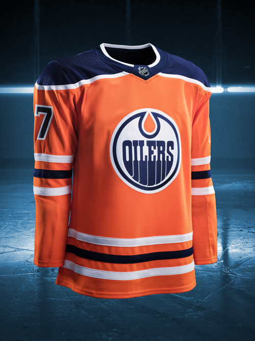
Last night, the NHL and Adidas made their pact official, as the rebranded uniforms for each team were unveiled, and to say most were rather disappointing would be an understatement. Since every team unveiled their new home looks, rather than go through each team, I'll go through the highlights and lowlights.

Before getting into that, it should be noted that most of the teams will carry over their looks from last year, with the collar being the lone exception, as it will look decidedly different.

The highlights: There were really only four teams who benefited the most from the Adidas rebrand.


The Colorado Avalanche were the worst affected by the Reebok branding of 2007, but now that the jagged striping that adorned their first looks has returned, it automatically puts the Avs in the highlight category. Granted, I would have loved for more than gray separating the maroon and the blue, but given how badly their Reebok jerseys looked, you'll take what you can get.

I can technically put the Carolina Hurricanes in the highlights category, since they returned the storm warning flags onto the waist stripes, albeit in a more subtle manner. Adding more black to the waist and arm stripes actually adds a little more to what was a rather ordinary look.

The Minnesota Wild almost always put out winners when it comes to sweaters, and this look is no exception. The fact that they're going with forest green as their regular home colors only cements the look as one of the best of the rebranding.

I'm going to level with you: I had extremely low expectations for what the Vegas Golden Knights were going to trot out. To say that they exceeded expectations would be an understatement, as it looks passable, though the red does look out of place.

As for lowlights, let's just say that Calgary, Ottawa, Columbus, Vancouver, and Washington all had their chances to make a fresh start, and none of them took that chance, instead opting for familiar looks. Also, Buffalo only took half a chance, getting rid of the piping, but for some reason, keeping the numbers on the front of the jersey.

Edmonton going with orange as a full-time home jersey may be a nod to their early days in the WHA, but that doesn't mean it should have remained as such today. Going with a darker shade of blue doesn't help.

Nashville got rid of the piping, opting for a cleaner look. Too clean, if you ask me, as there's not nearly enough navy on the jersey. Even a smaller striping of navy on the waist and arm stripes would have brought it out of the lowlights category.

This was the rebranding that the New Jersey Devils went with? I was hoping for a lot more than just broadening the arm stripes and getting rid of the waist stripes, which is the biggest no-no that they could have done.

Thursday, November 17, 2011

Islanders in Black

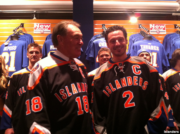
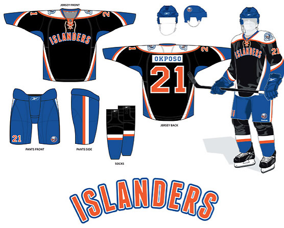
Remember when the New York Islanders saw the prototypes for their third jerseys get leaked out?  Now, do you remember your first reaction?  I certainly do, and my reaction now is a lot different from "Dear fucking Christ, no!" to "It's not so bad, but the Isles could have done so much better."  Yesterday was the official unveiling of the much maligned third jerseys by the Islanders, and as you can see, there is the number below the "ISLANDERS" word mark.  As for the name plate, there are no actual pictures, but thanks to NHL.com, there is visual proof of the back of the jerseys, and I have to say that I'm happy that they didn't go for the Philadelphia Flyers style of name plate.  Would I go out and buy the Islanders' third jersey?  No, but I would not put it on the same level of ridicule as the Atlanta Thrashers' third jerseys or any of the Dallas Stars jerseys they have right now.

Tuesday, October 25, 2011

Bringing Back the Black

Since the Ottawa Senators decided to go Heritage this season, that unofficially retires the previous attempt at a black jersey (the SENS jersey, which will be discussed at a later date).  Now, did you know that the first attempt at a black jersey as an alternate happened because the original alternate jersey, introduced in 1997, became their home jersey two seasons later?  It would so happen that a season after that change, the Senators decided to bring back the black, this time as an alternate jersey.  Aside from the distracting "arrows" on the sleeves and waist, this is one of the better alternate jerseys, and surprisingly, would be a better primary jersey than the one they called their home (since the 2003-04 season, when the home/away designations changed to its current format), though to be fair, that jersey was special in more ways than one for the right reasons.

Tuesday, September 6, 2011

Jets Unveil New Look

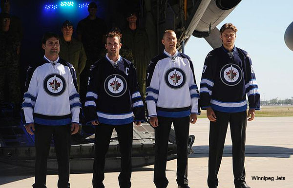
Today marks the unveiling of the new Winnipeg Jets jerseys.  It was done with much pomp and circumstance, with the Wing 17 in Winnipeg as a backdrop.  So, let's get to the nuts and bolts of this look.  As you can see, the home jerseys are a darker shade of blue, with white and light blue striping on the sleeves and the waist.  Personally, I wouldn't have minded seeing the two shades of blue reversed, but it's not horrible.  The road whites are actually unique in the sense that the sleeve stripes go all the way around, even with the shoulder striping going all the way down.  This is unique, and is actually a nice attention to detail.

The lettering on the player names is decent, but it is the numbering that really sells me on this jersey.  Modern design done right: stylish, yet not complicated.  You have seen the primary and shoulder logos a month ago, and that was an expected thing.  I would definitely buy the road whites, but give me time on the home jerseys.

Tuesday, August 23, 2011

Worst Jersey Ever?

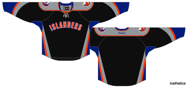
Word on the grapevine is that the New York Islanders are wanting to introduce a new third jersey for the 2011-12 season.  As a team that desperately needs any good news, this proposed design that you see is not even close.  This design is pretty much an alteration to a proposed design that was leaked earlier this month.

 As you can see from both designs, the gray in the latest design has replaced the white, and the numbering and lettering are unconfirmed, as opposed to the outwardly horrid lettering on the player names, complete with clashing nameplates.  Now, as far as the latest leak goes, this isn't just bad, this is "worse than those Atlanta Thrashers home and alternate jerseys from last year" bad, which mind you, says a lot.  The best way to voice your opinion on this potential jersey besides "Dear fucking Christ, NO!"  With your wallet, particularly if this actually gets out onto the streets, as in don't waste your money on this garbage.

Tuesday, April 26, 2011

Blue Days in Columbus

COLUMBUS BLUE JACKETS


Another year, another early round of golf for the Columbus Blue Jackets.  Seemingly every year, the Blue Jackets are unable to make any noise in the playoff race.  The perpetual need for a first line center hasn't hindered Rick Nash's ability to score, but it sure would be a nice thing to have, particularly since there is no second option on offense.  Year in and year out, it's been Nash and a bunch of question marks.  Two years ago, Steve Mason looked like the answer in goal.  Now, it seems like he could be destined for backup duty after another subpar year.  Speaking of disappointments, Nikita Filatov was supposed to stick on the Blue Jackets squad this year.  Instead, he spent most of the season in the minors and now, Blue Jackets fans are wondering if he is just another in a long line of first round busts.  And on the subject of busts, there's this:

A jersey so horrible that the schedule for when the team would be wearing them was taken down after a couple of weeks from when it was first introduced and just might be scrapped after this post-season.

Tuesday, April 5, 2011

NHL Uniforms

When trying to come up with ideas on which looks on the ice are horrible, one of my favorite sites to go is NHL Uniforms.  It has the most comprehensive databases for each team, past and present, and goes into detail as to what each team wore during specific time periods, as well as offer a season by season look of what each team wore that season, from the jerseys, to the socks and breezers, even the patches worn for that season, be it for being host to an All-Star Game or marking an anniversary for being around for so many years.  It's useful for those who wish to customize a jersey to a specific season and would like to know how to replicate that particular year perfectly.

It is this website that I will be using in assessing each of the current teams' usage of the Reebok Edge design that was introduced in 2007.  A few years have passed, and I think the time is right to see how it's worked for all of the teams so far.

Tuesday, January 18, 2011

Jersey Death Watch? Already?

The 2010-2011 season isn't even over, yet there is already a death watch for jerseys destined (or doomed) to their demise after this season.  The Atlanta Thrashers' third jersey is already being talked about in getting the axe.  You know, while they're at it, could someone please tell the Thrashers that their current home jerseys need to be shelved for good?  How that jersey is still in circulation, I will never know.  There is also talk of the Dallas Stars introducing a different third jersey.  Hmm, maybe the Stars think about introducing different home and away jerseys instead, since the current style is quite boring.  If I were to buy a jersey right now, the Dallas Stars jersey would be very low on the list.  Just look at this jersey:

Really?  This is how you want to represent your team?  Why couldn't this jersey be the alternate jersey?  I would have far fewer complaints if that were to be the case.

Two more changes that are being thought of are the Oilers going retro for their home and away jerseys.  I can tell you right now that this change is long overdue, and as much as I liked the change in 1996 to darker colors, the orange and blue needs to make a full comeback...now.  One more planned change of note: the Los Angeles Kings making their current third jersey their home jersey next year.

The plan is to have a road version of this jersey and the retro purple and yellow jerseys that they have been wearing from time to time this year as their alternate jerseys.  Again, like the Oilers, as much as I like the purple and black, the time to make this change seems about right, and what better way to do that than going back in time to the early days of when Wayne Gretzky made his L.A. debut and the silver and black era began.

Monday, January 17, 2011

Jersey/Sweater Fouls: the Rules

Okay, so there is this Puck Daddy blog on Yahoo that I read frequently, and when it comes to the blog, there is one piece that I always read without fail: the Jersey Fouls.  However, reading this last piece on the fouls has me thinking: "What exactly are the things that can be considered a Jersey Foul?"  This, my half-dozen readers, is where you come in.  Comment on this piece with what you consider a Jersey Foul and on a later date, I will write a piece that covers what is considered a Jersey Foul and what is not.  And for you Canadian folks, yes, I know it's called a Sweater (hence, the title of this piece).

If you need ideas on what to look for, here's an idea: Puck Daddy Blog

Monday, October 25, 2010

Doomed to Repeat Itself

Most of you know this jersey that you see above.  You will likely have seen a powder blue version floating around masquerading as the Colorado Avalanche third jersey.  However, since that jersey is still in use, there isn't a chance that I can induct it right now.  That doesn't mean the original version can't be talked about today, though.  This version was worn from the 2001-2002 season up to the 2006-2007 season, and like many of the third jerseys prior to 2008, was retired once the RBK Edge jerseys were introduced.

As you can tell, the Avalanche third jersey didn't exactly use up all of the imagination afforded to it, as the word "COLORADO" is in a diagonal patter on a burgundy background and the striping isn't all that inspiring, either.  The team's primary logo is on the shoulders of the jersey, and...well, that's about it, really.  Ugly?  No, but a really uninspired effort, one that is repeated today (for some reason).

Saturday, October 16, 2010

Birth of the Blue and Green

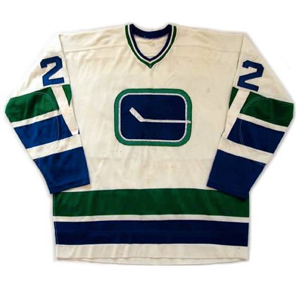
Yesterday, I talked a bit about the Los Angeles Kings' first looks and brought up the Vancouver Canucks' first looks.  Well, what better way to segue into today's subject than the first looks of the Vancouver Canucks.  As you can tell by the jersey above, the stick in the rink was around, and if you're wondering where the team could have thought about those Flying V jerseys that would make their debut in the late 1970's, look no further than the jersey's sleeves and the "V" that runs down the sleeves.  Who knew that this would be a theme for the Canucks in their 40 years: weird and out there designs.  It also has its charms, which makes the revival today all the more remarkable.  Of course, this design will probably be only for this season, which like the 1970 design, is all too short for it to be out there.  Of course, many people thought the Flying V jerseys lasted too long, but the Canucks could at least, claim to have been to the Stanley Cup Finals in them, so whether you liked it or not, you had no choice but to look at them.

Friday, October 15, 2010

Lakers on Skates

I haven't done one of these in a while, and with the season underway, I figured that this would be a good time to do something with jerseys.  When the Vancouver Canucks broke out their alternate jerseys for their 40th anniversary on opening night Saturday, it was almost like a trip back in time, with the team honoring the 1970-71 team and a passing of the torch, so to speak, as Orland Kurtenbach, the team's first captain, handed Henrik Sedin his new jersey, complete with the captain's C, as he was named the team captain, replacing Roberto Luongo.  The Canucks weren't the only ones to break out their first looks: their opponents for that evening were the Los Angeles Kings, who were also the team's first opponents in their first game in the NHL 40 years ago.  The Kings broke out their purple and yellow jerseys that were the team's road jerseys in their early days.  The Kings' jerseys, in particular, could be mistaken for "Lakers on Skates," as both teams not only shared the same colors for a time, but also the same building, as they do now.  Yellow is normally considered a hideous color on any jersey, but there are instances where it actually works, and both Los Angeles teams pull this off well.

The Kings had this color scheme until 1988, when Wayne Gretzky was acquired.  Since then, they went from black and silver to black and purple, which in many ways, is a nice way to tie the past color schemes to create a good present day Kings jersey.  For one night at least, the Kings brought out the vintage looks and scored big time, as did the Canucks.

Tuesday, August 31, 2010

The Canucks Alternate Jersey 2001


If you haven't gathered from the color scheme of this blog or the picture of the schmuck who writes this blog, then you wouldn't know of the Canuck love that this blog gives.  And since tomorrow begins the 2010-2011 NHL preview, I figure to transition into that the only way I can: with yet another jersey that looks bizarre.

Today's jersey is the Vancouver Canucks alternate jersey that they wore from 2001 to 2007.  Many of you know of the many looks that the Canucks have worn over the years, from the original blue and green stick in the box to the "Flying V" jerseys to the spaghetti on skates of the late 80's and most of the 90's to the quad-colored orca to now, which is the orca in the team's original blue and green colors.  This particular jersey utilized a navy blue fading into red scheme and as you can tell from the jersey, it looked like one giant mess with the Orca placed in the middle of it.  Call me insane, but like many of the Canucks looks, I wouldn't mind having this jersey.  In fact, there are many worse looks than this; it is just that this one is just flat out weird.

Monday, August 30, 2010

The Star Jersey


The past few days, I have been coughing up a storm, which explains why nothing was written the last two days.  Now, since the NHL season is less than 40 days away, the next 30 days or so will be devoted to a preview of sorts.  That is just a day or two away, so in the meantime, here is something to tide you over until then.

Today is a jersey day, and unlike most jerseys that I talk about, this jersey is one of my favorites.  The Dallas Stars jersey that was originally introduced during the 1998-1999 season as an alternate jersey (shown) was largely based upon the All-Star jerseys of the mid-90's.  The Stars wore this jersey exclusively as a road jersey when they were making their Stanley Cup run that year and the next year, a home white version was made.  These jersey were in existence until 2007, when the jersey makeover hit all of the teams.  Unfortuantely for Dallas, that meant the end of the jerseys and the beginning of the rather boring home and alternate jerseys that you see today.

Besides the unique design of the Stars' jerseys of the late 90's to most of the 2000's, the Stars played up the green on both jerseys and the numbering and names on the backs did nothing to take away from the overall design.  Even without the logo on the front, the design of the jersey itself would have been enough to let fans know who the Dallas Stars were.  Some of that thunder was taken in the mid-2000's, when the Stars introduced the rather unfortunate "Mooterus" jersey.

Friday, August 27, 2010

Going Retro


Everyone that has followed the New Jersey Devils and Martin Brodeur know the mask that he wears.  In recent years, he has had the mask modified from the partial Devils logo to the more personal "MB" on the crown of the mask.  However, for the game on St. Patrick's Day in 2010, he sported a different kind of mask.  Unless you happened to be around for his debut in the NHL, you will probably not recognize the look.  The mask is a replica of the one he wore during his first NHL game in 1992, when the Devils still had the red and green color scheme.  This coincided with the Devils going back to that color scheme for that game, which you see below.

I personally would not recommend that either party go retro for more than ten games in a season, but these looks are a nice reminder of what the Devils were when they started out in New Jersey.

Monday, August 16, 2010

The Blues Look of the mid-90's


This piece has been bothering me for a while, but since today is somewhat slow, I can sneak this one in.  This is actually a two-parter, as it covers both a team's home and away jersey for a specific time frame.

The St. Louis Blues have undergone some minor jersey changes in their time before 1994.  No matter the look though, the Blue Note has always been at the heart of everything that the Blues have done.  1994 marked a rather dramatic change, though, as the color red was introduced in a more involved manner, as opposed to just a complimentary accent that it had been.  As you can see by the picture, diagonal striping lifted from the Mighty Ducks of Anaheim (which by the way, if you're lifting from the Mighty Ducks design, then you're just reaching too far) and numbering that just simply looks odd because of the diagonal design.  The home jersey (white for you folks that remember when hockey's home team wore white) isn't that bad, but the road jerseys have one of the most uninviting amounts of red that grace a jersey, for a team whose primary colors are blue and yellow.  The thin striping in the diagonal design makes the jersey even more cluttered than what it is, but I do have to give the Blues credit for the shoulder patch, as it drives home the point of the team's name.
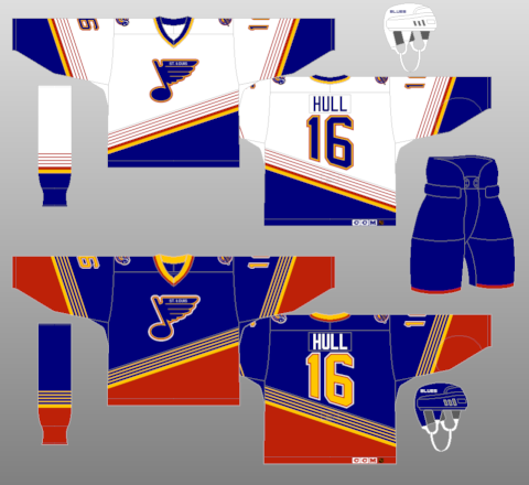
Thankfully, a third jersey came along in 1999 that signaled the beginning of the end of the diagonal eyesores, and that third jersey is the basis for today's Blues jerseys, and a current third jersey that is equally appealing.

Monday, August 9, 2010

Swords Jersey


It's been a while since I've done one of these jersey talks, so here is one that has been uncovered from the mothballs.  From the Buffalo Sabres days of red, black, and silver comes this third jersey.  This particular jersey played up the Sabres part of the team name as opposed to the primary jerseys that focused more on the buffalo.  As a reference point, the primary logo was a buffalo head that some thought was a goat, but had some intimidation to it.

Back to the jersey, this red version had the swords crossed, much like the Sabres' original logo, but without the buffalo above it.  It also featured the word "Buffalo" on the bottom of the jersey, much like the current Los Angeles Kings' jersey, which has had that style since 1997.  Where an otherwise above average jersey takes its breathtakingly idiotic turn is the neckline.  I don't know whether the Sabres' jersey wanted to do a traditional neckline or one of those sharp v-style necks that became fashionable with teams like the Phoenix Coyotes when they went to their current logo.  Whatever it was, it looked like a disaster on an otherwise pretty decent jersey.

Tuesday, July 27, 2010

Thrashers Home Jersey


When I write about the most unusual jerseys of all time, I try not to make it about something that is still in use.  However, this entry has been bugging me for a while to the point that I can no longer ignore it.

Every year since the 2004 season, I have always asked the following question about the Atlanta Thrashers (other than why can't they be competitive in their own division): What the hell is up with their home jerseys?  The first image you see is the original incarnation of the Thrashers' current home unis.  As you can see, this is one of the most unusual, if not downright ugliest jerseys of all time.  Originally introduced as a third jersey, it eventually became the home jersey, replacing the jersey you see below:

Now, what was wrong with this jersey, other than the fact that the logo on the front is one of the worst of all time?  All one would have had to do was switch the logo on the front with the one on the shoulders.  As if that wasn't enough, when Reebok decided to make their Edge jerseys, every team had to adjust their jerseys to fit according to the design of the jersey.  Here is Atlanta's home jersey design, in accordance to the RBK Edge look:

The look is marginally better, as there isn't that blue blob running from the armpit down the sides.  However, that design on the left sleeve, namely the "ATLANTA" running down the side, combined with nothing really going down the right side kind of makes you wonder who in their right mind would want to be wearing this jersey 30 games or so out of the year.  I say 30 because Atlanta has a third jersey, which looks like this:

If the hockey Gods are kind, this would be the team's new home jersey and perhaps we can finally put an end to the ridiculous notion that the current home Thrashers jerseys are an acceptable look.

Tuesday, May 4, 2010

The Oil Drop Comet Jersey

When one thinks of the Edmonton Oilers, the first thing that pops into mind is the logo. You know, the orange oil drop that hovers over the OILERS in odd lettering. That logo became famous when the Oilers had their dynastic run in the 1980's, led by the likes of Wayne Gretzky, Mark Messier, and Jari Kurri. That team was not without its share of characters, as Marty McSorley and Dave Semenko were willing participants in dropping the gloves to protect the star players. The pieces of that team began to fall apart with the Gretzky trade in 1988 to the Los Angeles Kings, and even though the Oilers would go on to win another Stanley Cup in 1990, the pieces continued to crumble, as eventually, most of the team was broken up due to financial issues. The team hit bottom in the mid 1990's and for the most part, have always struggled to make the playoffs since. The exception to the rule was 2006, when they made it all the way to the Stanley Cup Finals, only to lose to the Carolina Hurricanes in seven games.

Feeling the need to add to their look in 2001, the Oilers broke out a third jersey. It was a radical departure from the Orange and Blue, or as the look was at the time, copper and blue, in that the logo was an oil drop encased inside a metallic comet with five rivets each representing a championship that the team has won over the years. The color scheme for that jersey was navy blue, silver, and white, which further symbolized this departure. These jerseys are actually a favorite of mine, as it provided a slick look for the Oilers to go along with the traditional design that I have been familiar with since childhood. The jerseys were retired in 2006, and are a sought after item. This was the definition of third jersey, in that it provided a true alternative for the team's usual logo. On a side note, the retro jerseys that were introduced last season as third jerseys are now the home jerseys, which proves that you can indeed, go home again.

Friday, February 19, 2010

Fish Sticks

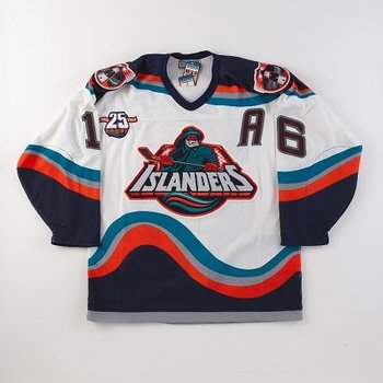
Take a good look at the jersey in the picture above. Now, ask yourself where you have seen the fisherman before. If you answered on a fish sticks box, then step on up and claim your prize of absolutely nothing. Today's subject is the ill-fated New York Islanders jersey and logo that you see here. The entire design lasted all of two years (1995-1997), with the logo being scrapped after just a little more than a year. When the logo and subsequent jersey design were introduced prior to the 1995-1996 season, there weren't too many people who liked it. Compare that to the total makeover that the Washington Capitals had prior to that same season, and it's fairly easy why the Islanders' makeover experiment was a total disaster.

I will go out and defend this design, as I was in the minority and actually loved the design at the time it was introduced. Even now, I wish this design lasted for longer than it did. It was unusual and to me, was one of the better redesigns to that point. Obviously, it didn't do the team any good, as they still stunk up the joint during that period, and for that matter, stunk the year before the makeover and the few years after the experiment was over. Maybe some other team with the gall that the Islanders had in 1995 will introduce something eye-catching.